An end-to-end design system and product surface for agents and customers — covering sales & appointment dashboards, a 7-step prepaid connection flow, a self-care storefront, and a 360° order & service console. Built from a blank canvas and shipped to production.
dtWorks is a customer engagement platform built by BahwanCyberTek — it gives contact-center agents and back-office teams one workspace to onboard customers, manage services, track sales performance, and resolve issues, while giving customers a self-care storefront to manage their own plans.
Every module — from a dashboard widget to a seven-step onboarding flow — moved through the same discipline before it reached engineering.
Sessions with call-center agents and telecom stakeholders to understand how a connection is sold, a plan is upgraded, and a complaint is closed today.
Greyscale layouts for every screen — dashboards, forms, storefronts — validated for information hierarchy before a single color was chosen.
A shared component library and data-viz language — cards, funnels, gauges, steppers — so every new dashboard looked native from day one.
Close pairing with engineers through build, plus usability passes with agents to catch friction in multi-step flows before launch.
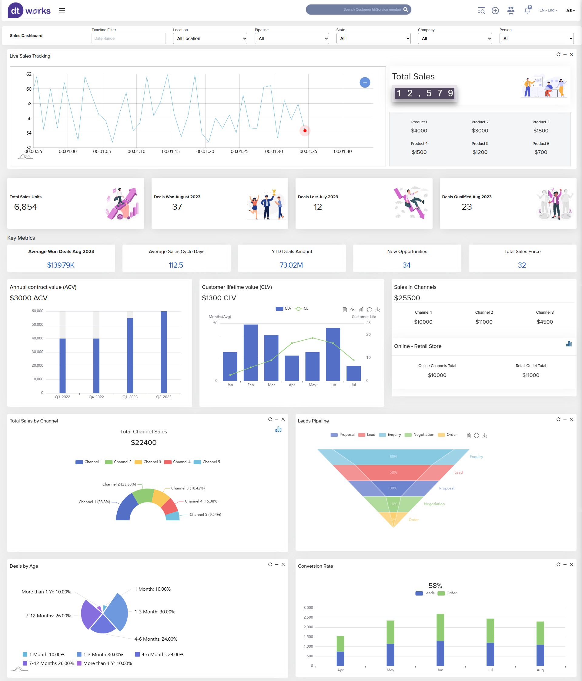
The wireframe locked in what mattered most to a sales lead — live tracking, deal velocity, channel mix, and pipeline health — before any visual styling. The hi-fi pass layered in dtWorks' visual identity: dark-on-light data cards, an orange accent for focus metrics, and illustration to soften a dense reporting surface.
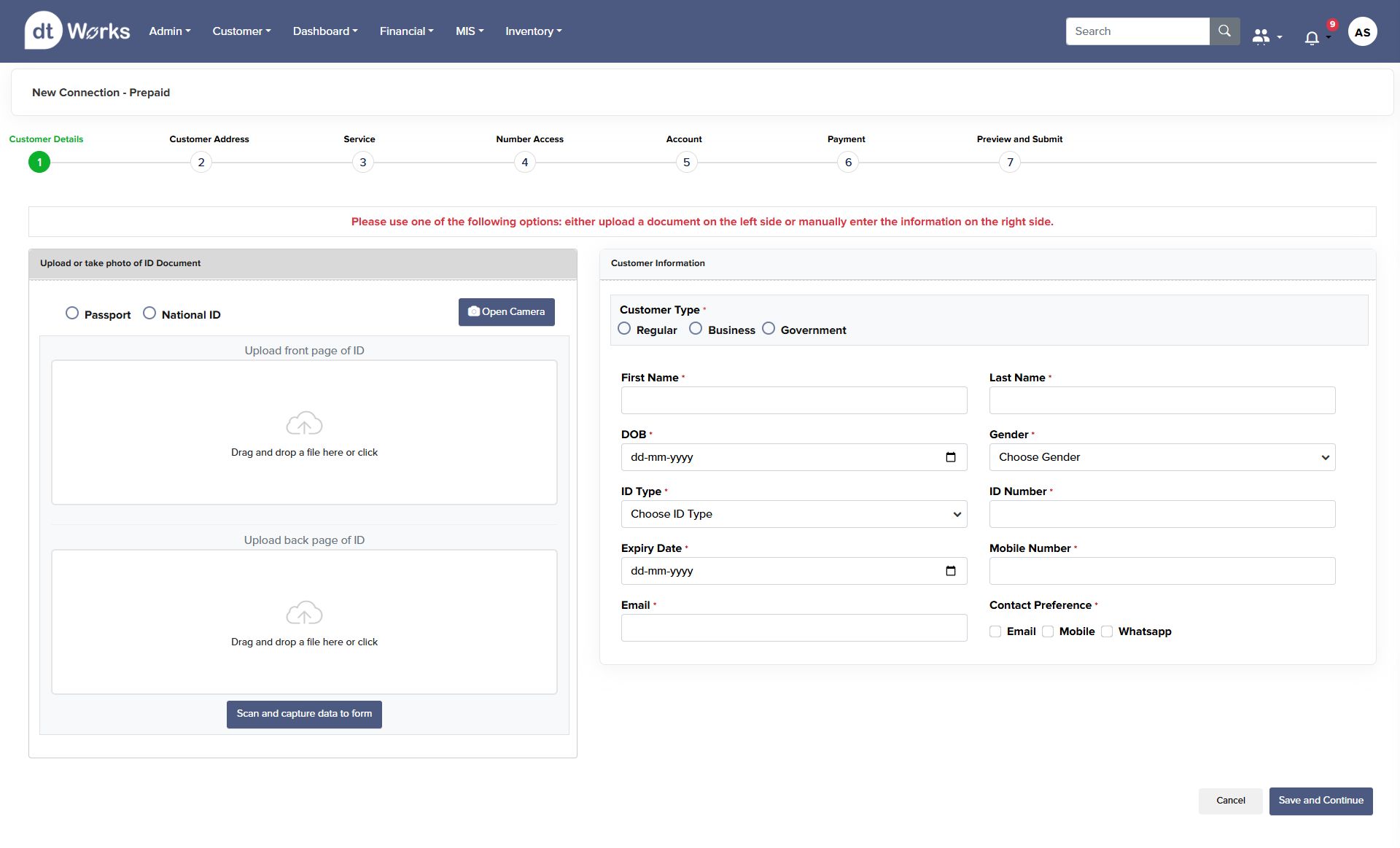
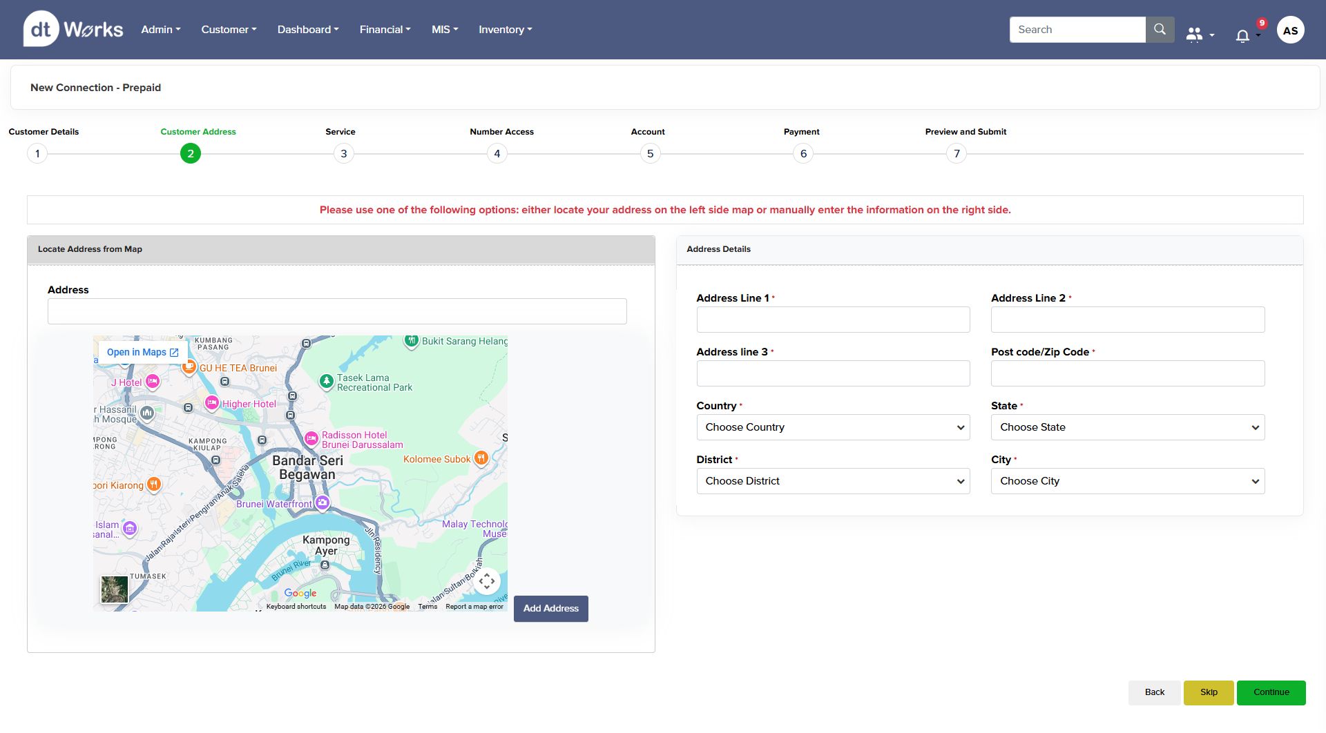
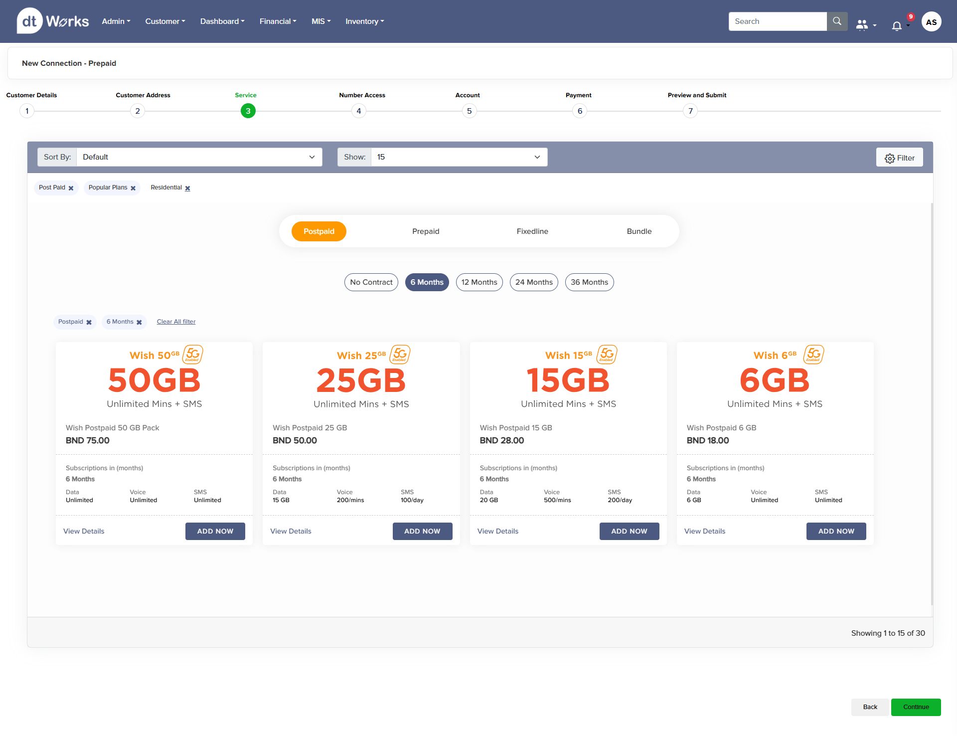
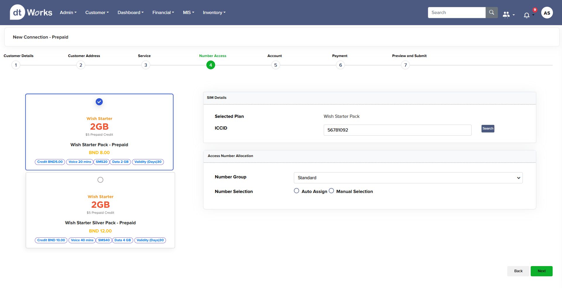
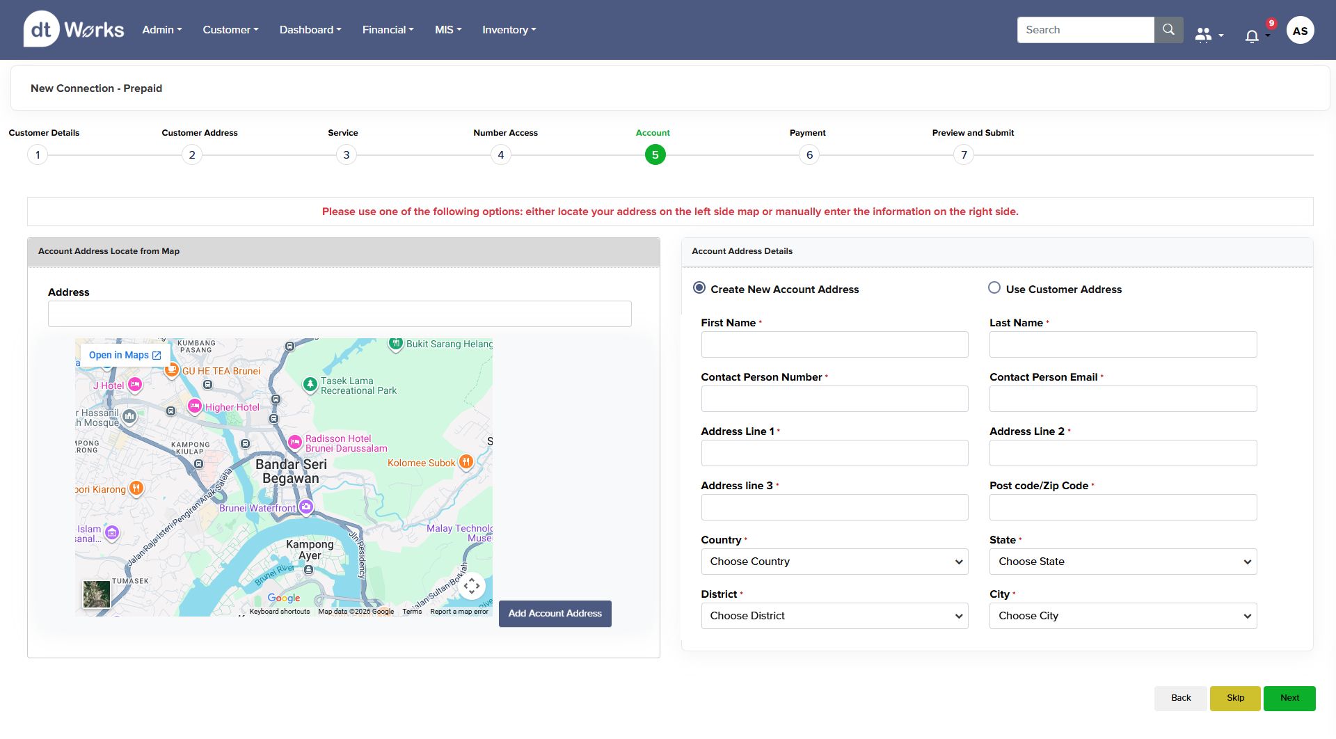
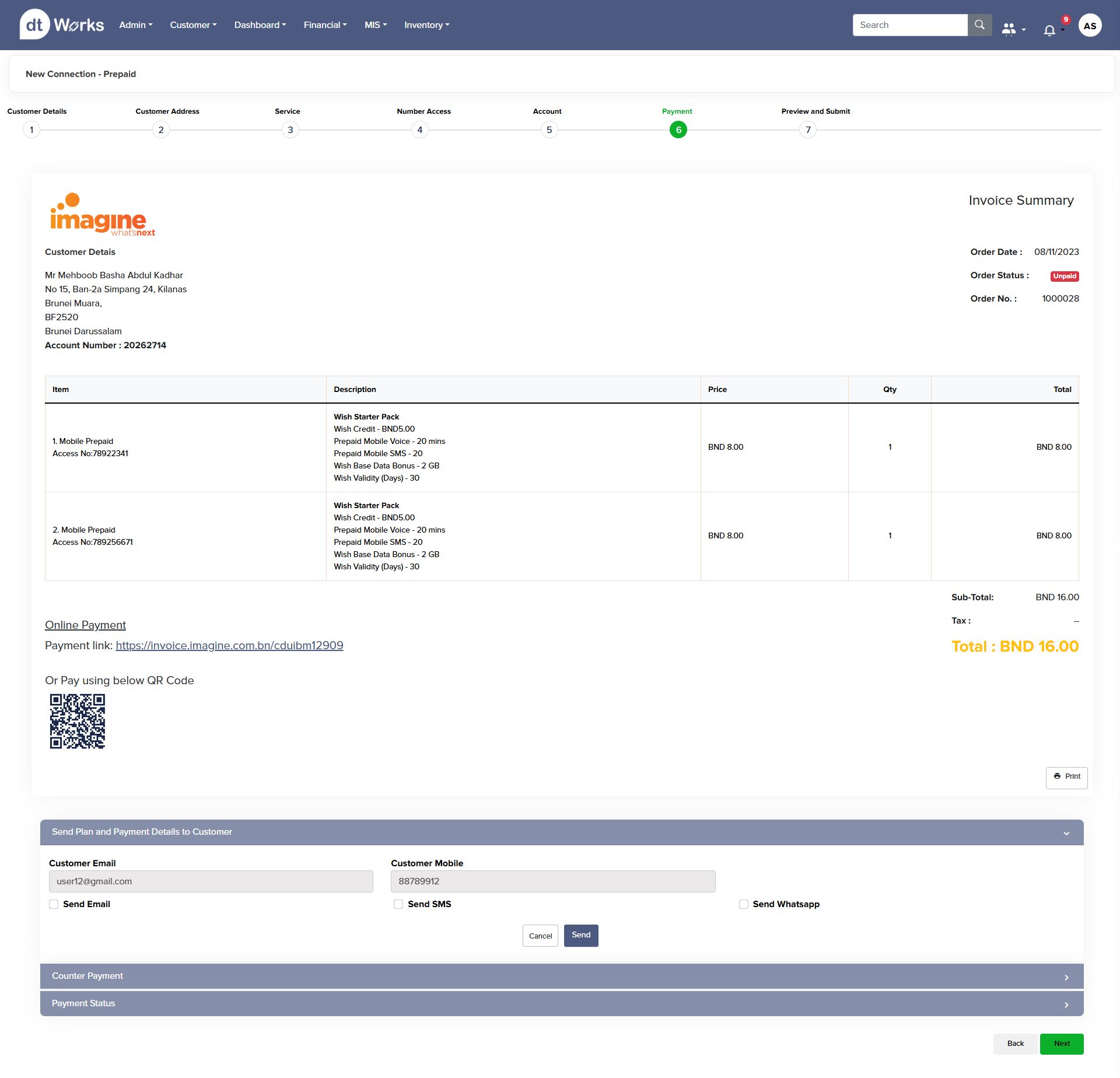
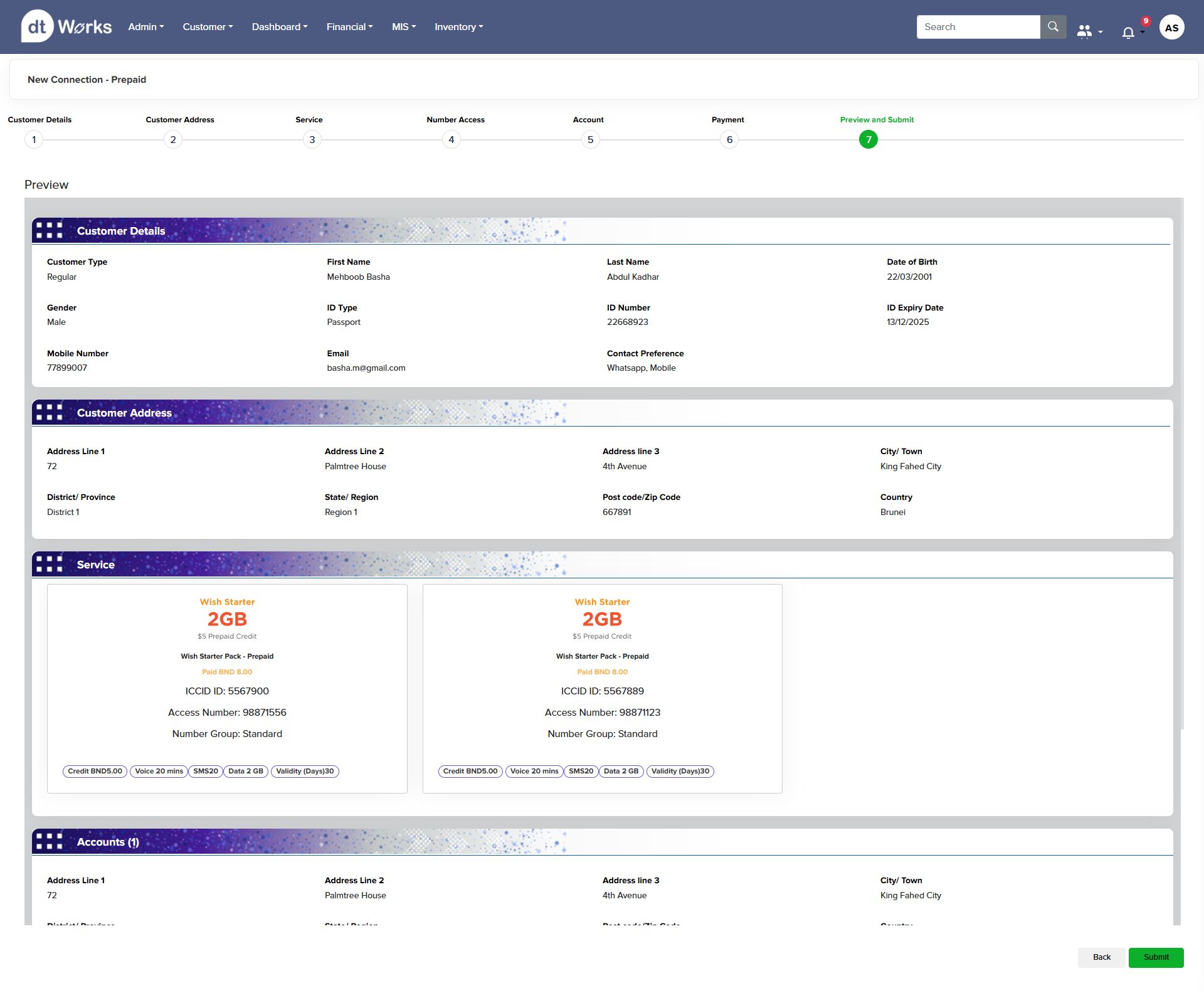
The prepaid connection flow is the platform's most-used journey — an agent captures customer ID, address, service plan, SIM and number, account and payment, all inside one guided stepper. Every screen carries a persistent progress rail so an agent can resume a journey interrupted mid-call.
Scroll to walk through all seven steps, from document capture to the final invoice-ready submission.
Prepaid Onboarding · Imagine


A dual-path pattern — scan a document or type it manually — runs through every capture step, so the flow never blocks an agent when a scanner isn't available. The stepper stays visible and clickable at every stage, letting an experienced agent jump back without losing entered data.
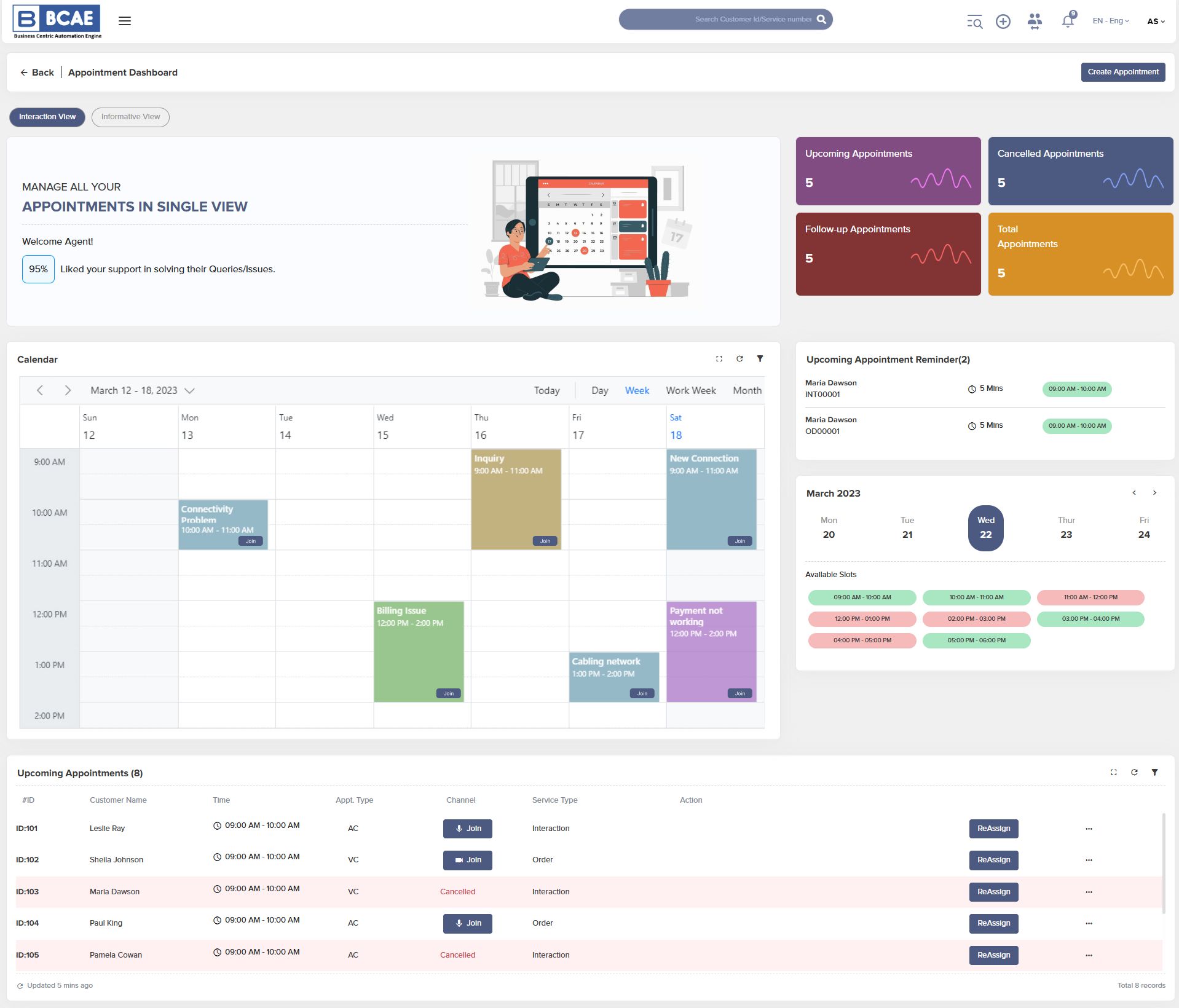
Gives an agent a single view of upcoming, cancelled, and follow-up appointments alongside a live weekly calendar and available-slot picker — reducing the back-and-forth of checking a separate scheduling tool mid-conversation.
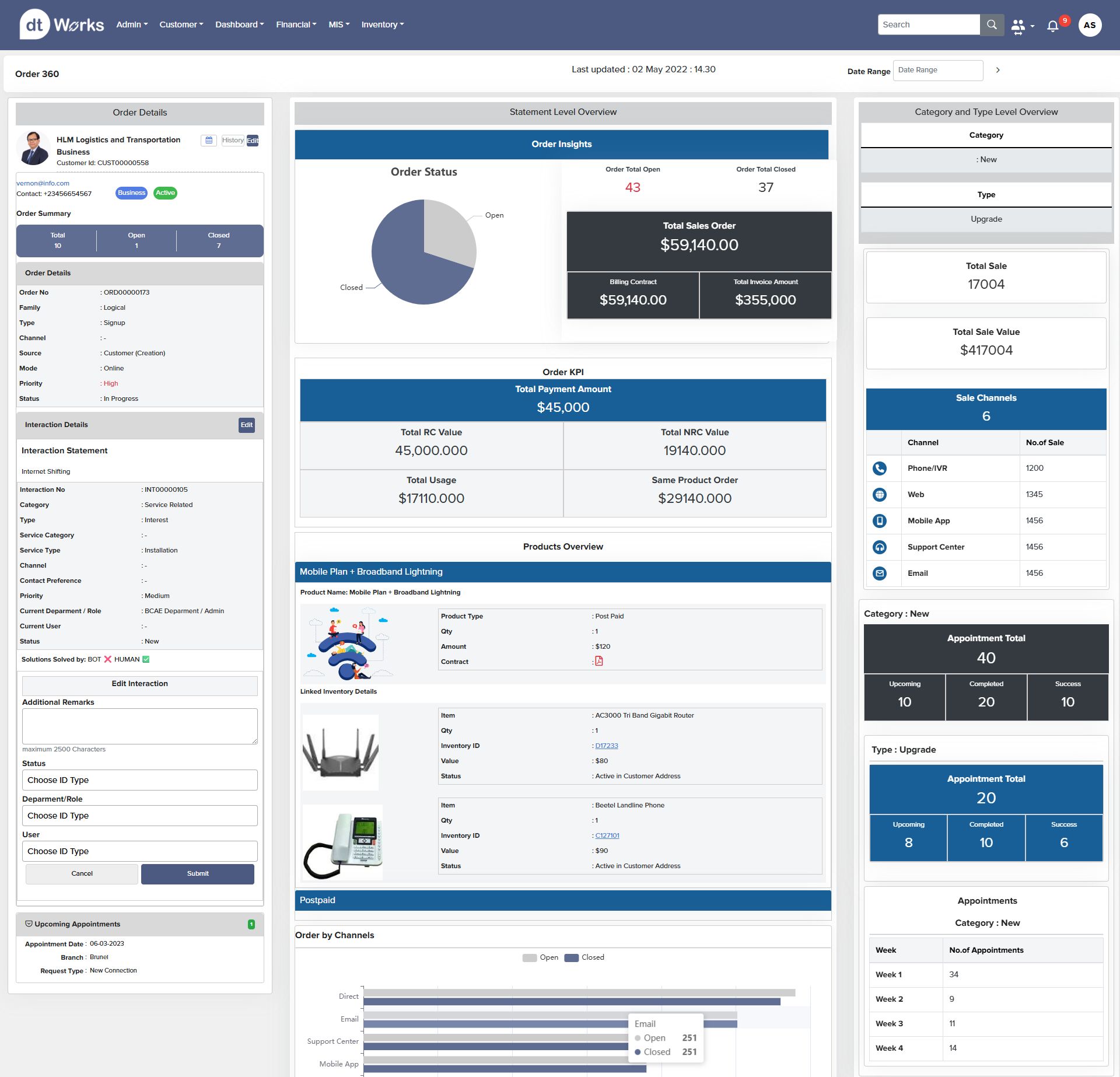
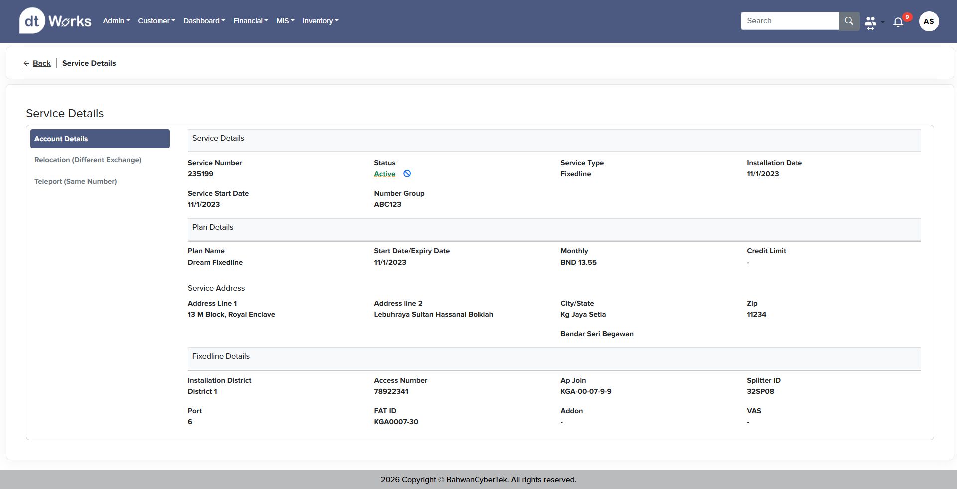
A single-page rollup of a customer's order history, interaction log, sales insights, and linked inventory — built so an agent never has to open a second tab to answer "what does this customer have, and what's still open." Paired with a focused service-detail view for a single connection.
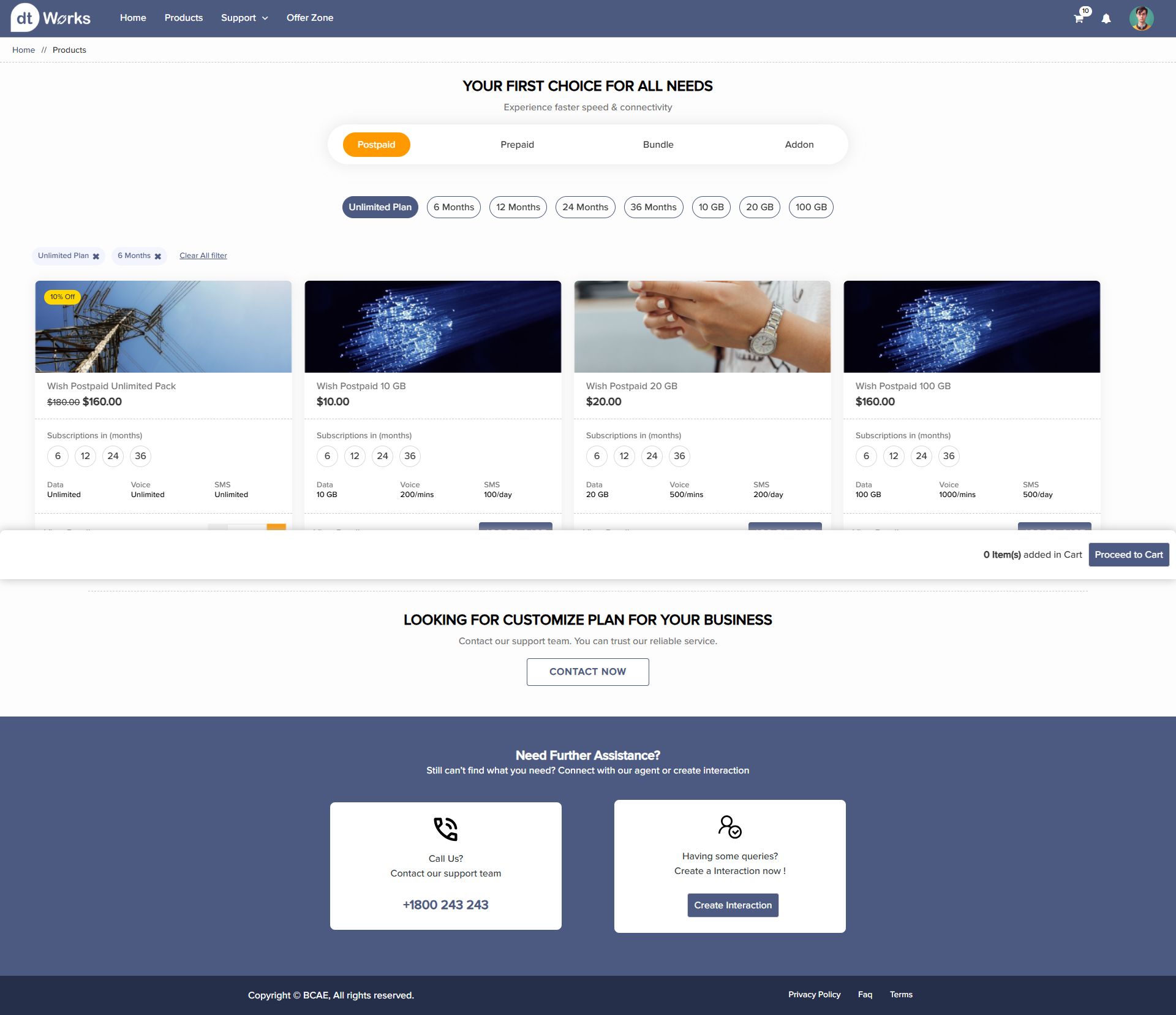
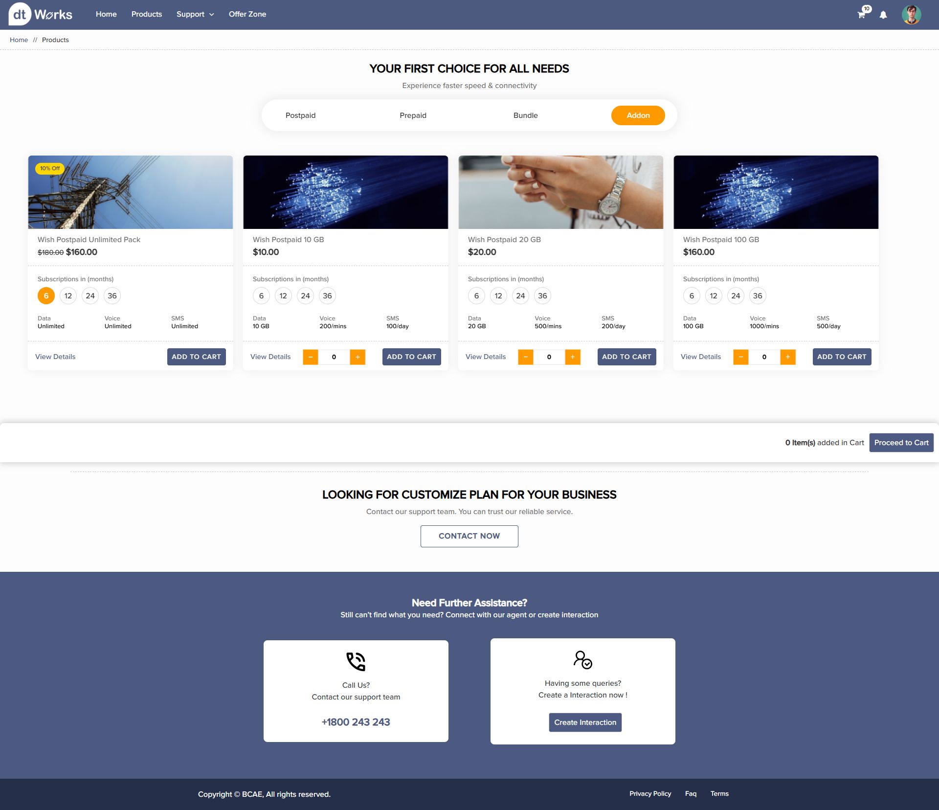
Customers browse and purchase the same plans agents sell — postpaid, prepaid, bundle, and addon — with quantity steppers, subscription-length toggles, and a persistent cart tray so switching between product tabs never loses progress.
Deployed to a real telecom operator (Imagine, Brunei) and a government contact center — designs weren't a concept, they carried live customer onboarding and payments.
The same component and data-viz language now powers agent, ops, and customer self-care surfaces — new dashboards ship without re-solving layout or chart patterns from scratch.
The onboarding stepper's dual scan-or-type pattern and persistent progress rail were direct responses to usability testing friction with live agents.
Because the sales dashboard's wireframe locked in real metric hierarchy — live tracking before vanity totals — the hi-fi pass was mostly a styling exercise, not a renegotiation of what mattered.
A seven-step flow only works mid-call if every step can be skipped, revisited, or filled two different ways. That flexibility mattered more than trimming steps.
Building one card, funnel, and stepper language early meant the appointment dashboard, order 360, and self-care storefront could all launch faster once the pattern existed.